ERIK C. CASILLAS
Illustration • Graphic Design • Art Direction


I draw it. I scan it. I build it. Then I put on some music and start clicking and bending lines. Almost everything on these pages was done in Adobe Illustrator. To me, that program allows me to create art in the way I always wanted it look.
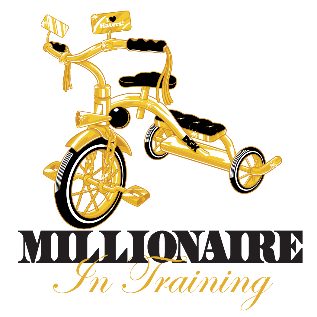
I like the logos I create to have vibe, and movement and to feel fun. I always try to inject a level of illustration into them.
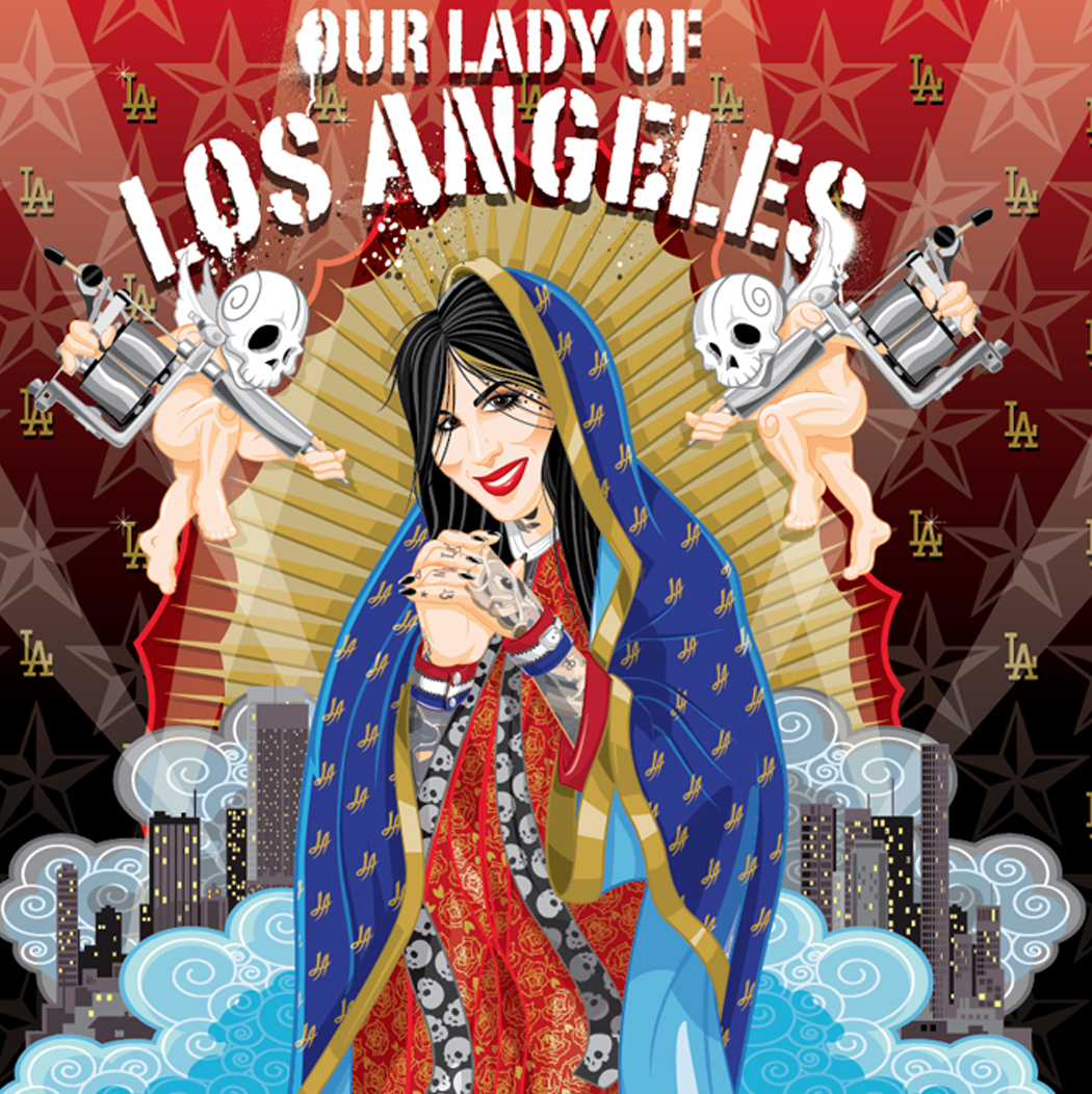
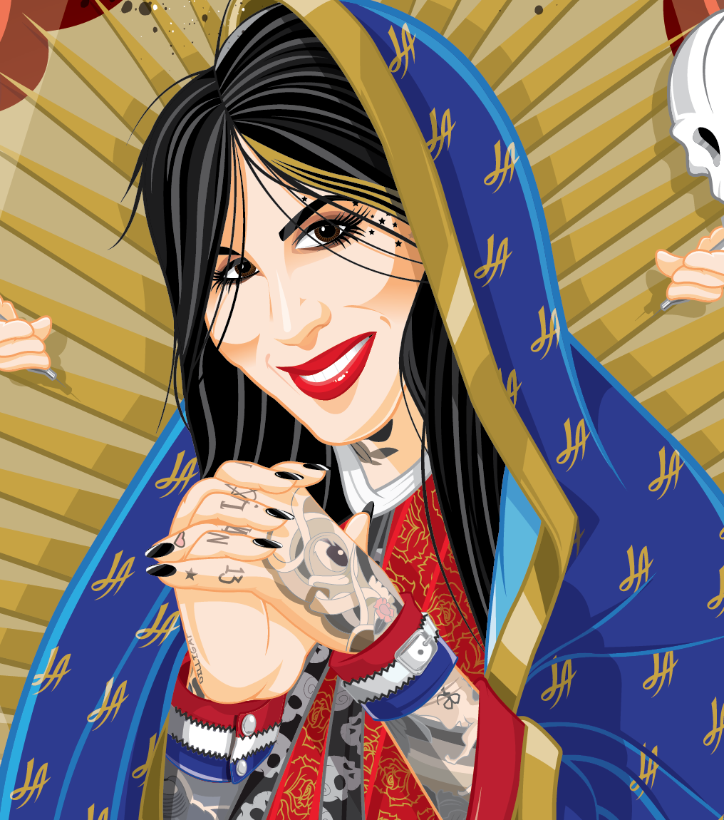
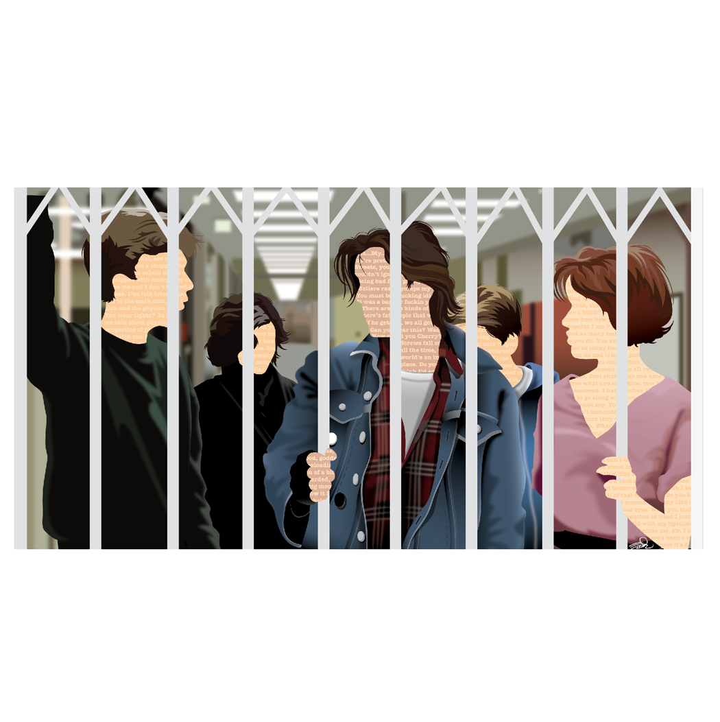
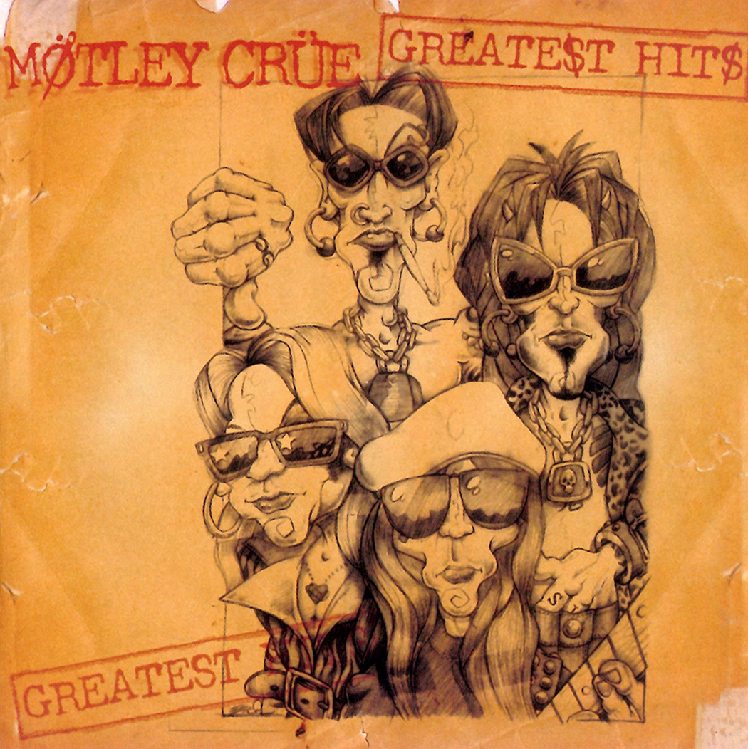
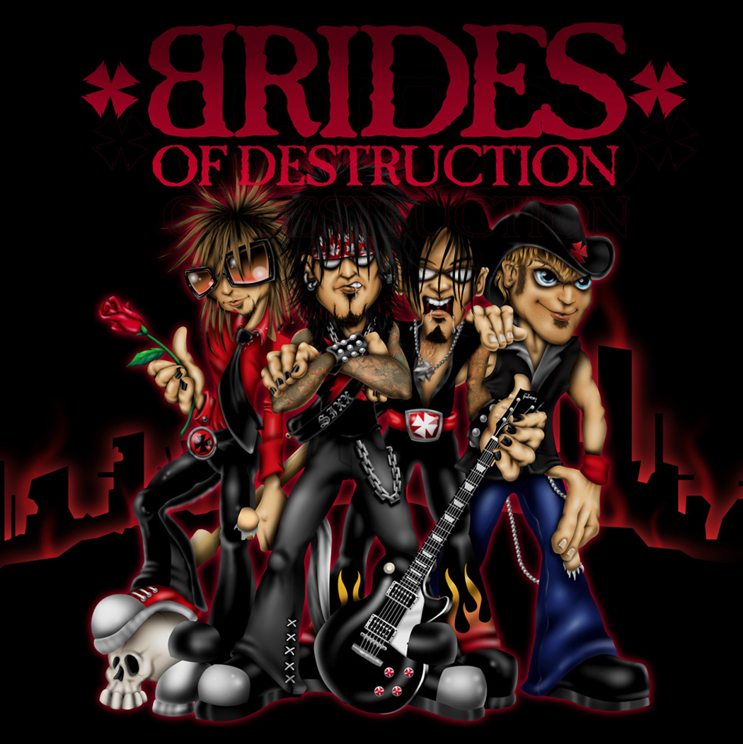
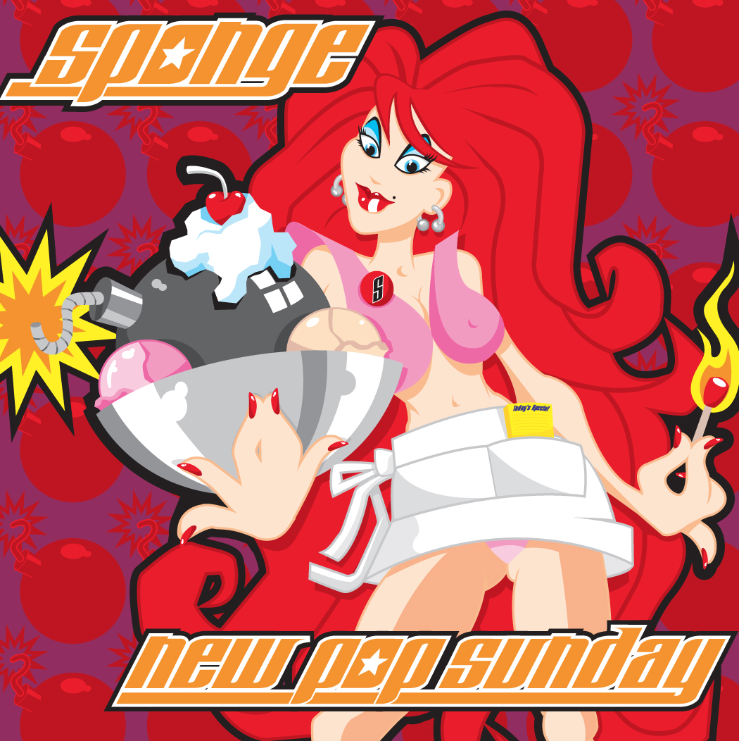
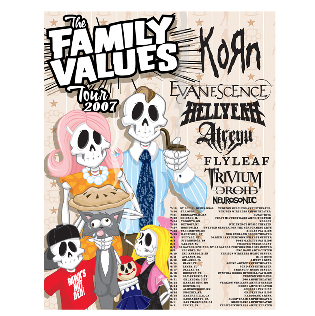
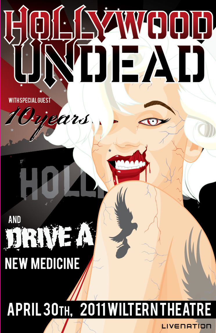
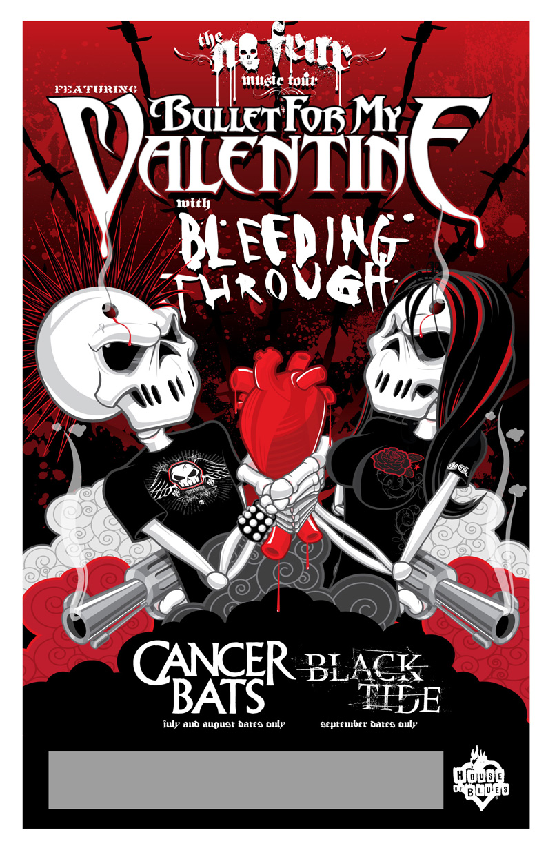
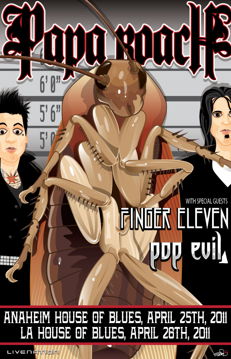
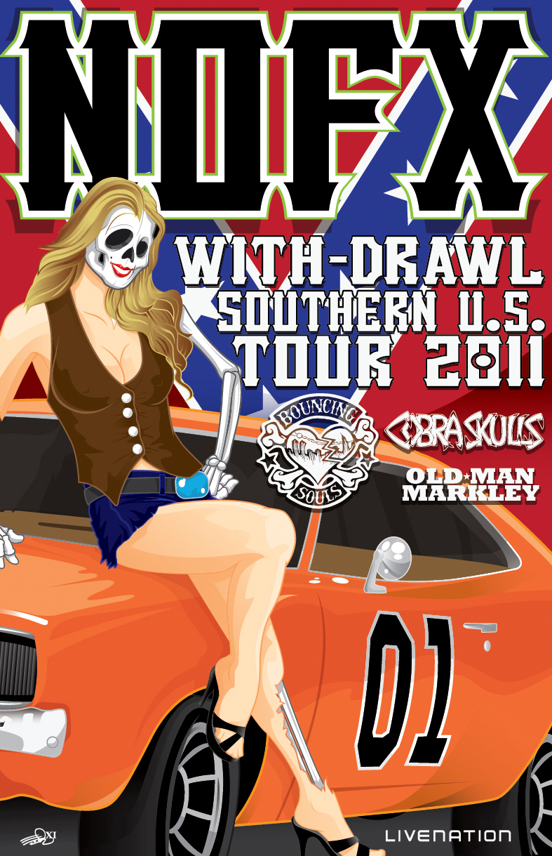
The music world was a wonderful place to cut my teeth. Always fun, always memorable. I was lucky to design album covers when they were still big enough to see the artwork.
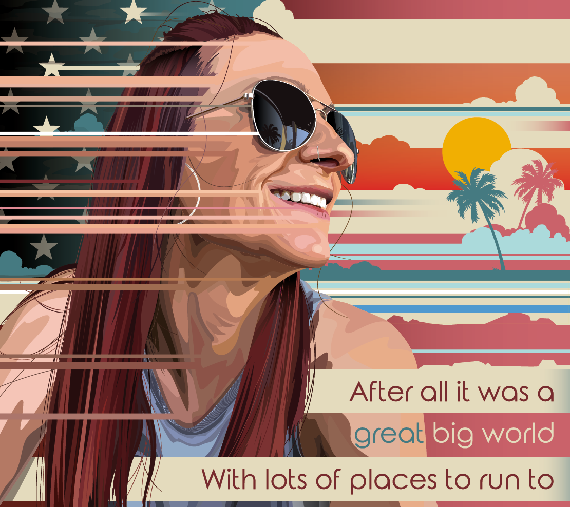
Stage Backdrop
Stage Scrims
Strage Scrim
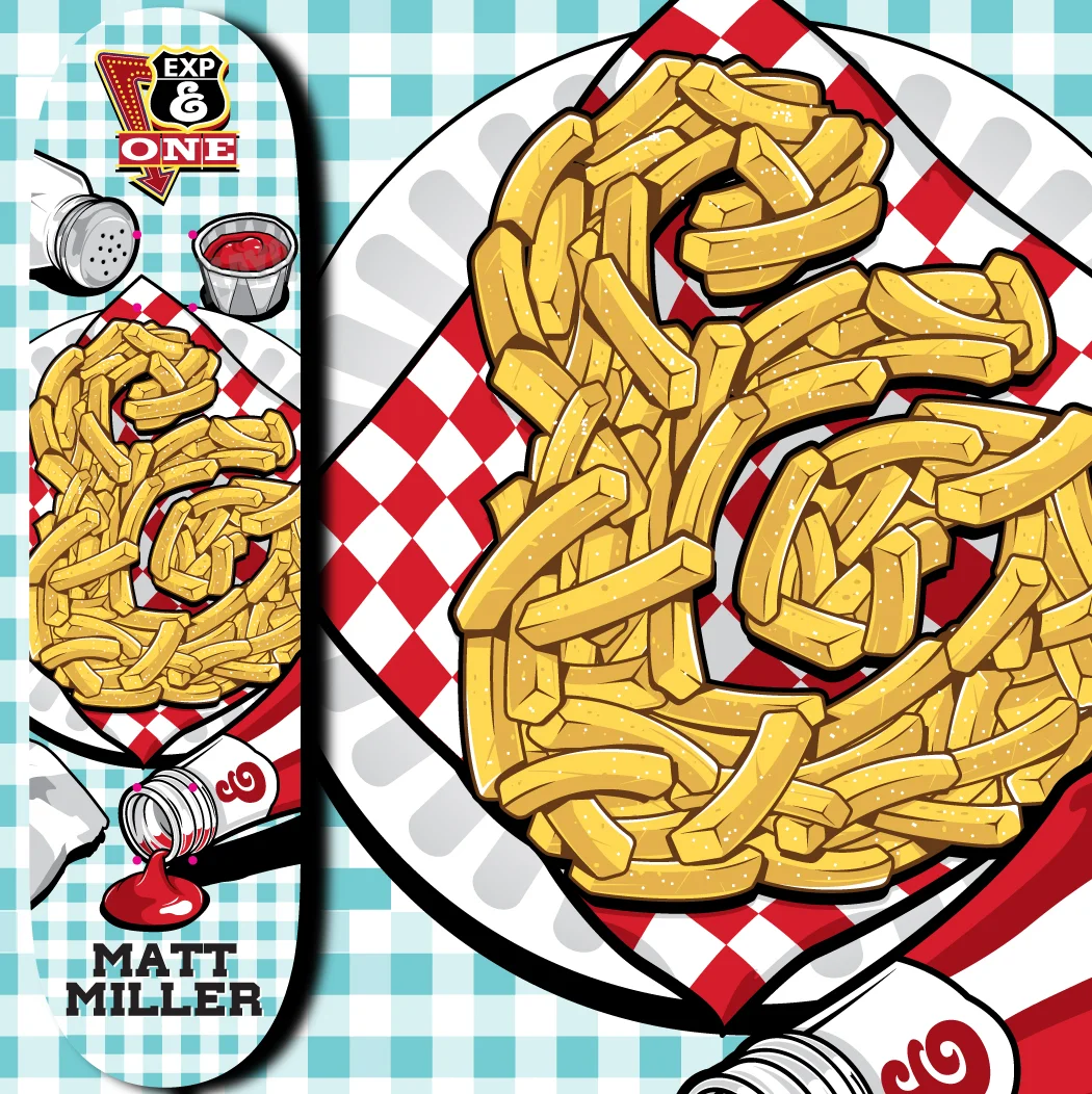
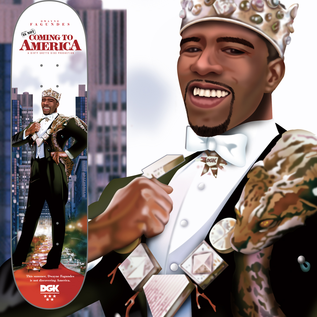
When you boil it down, skateboard graphics are glorified packaging. A kid picks a deck heavily influenced by the graphics and branding, and then spends the lifetime of the product trying to scrape it all off on concrete and steel. I loved working in the skate world because the requirements are simple. Be good, be entertaining, don’t be uncool.
One of the challenges I have always run into when doing illustration, is sometimes people say ,”It’s too cartoony”. Well, that’s kinda what I do. As the art director for a cannabis manufacturer, I don’t run into that too much. Like beer, it’s my believe and approach that cannabis should be fun and not take itself too seriously. When it comes to creating art for different strains, I really get to stretch my legs and be a little ridiculous.
Because beer should be fun.
Annabelle, Annabelle, Lost Her Head, was the first time I had done illustrations for a children’s book. Hopefully not the last.
Same vibe as doing artwork for decks only the size of the wheel and the hole in the middle add a degree of difficulty in creating graphics.
Make it recognizable. Make it nice. Make them all look related. A branded family of packages from logo and brand inception to finished product.